Reinventing the DHTech logo

Earlier this year, when we were getting ready to order DHTech swag to bring to the DH2023 conference and share with all of you, we hit a snag: we didn’t have vector versions of our logo, or even any high-resolution versions.

Original DHTech logo
The original DHTech logo was designed by Johannes Biermann and Alexander Steckel, and it was a servicable logo. We were grateful to have it, and it’s been useful. But when the opportunity came to revisit it, there was a sense that the logo communicated “tech” pretty well but not so much “humanities.” A few people also commented about the lack of color.
Somehow, I got inspired to revisit and rework the logo. At first I started trying to trace and recreate the existing logo in Figma - but why trace a drawing of a gear manually when you can write code that to generate any number of different gears? I had been experimenting with drawing leaves in d3.js radial coordinates for one of my projects, so I already knew how to start.
I’m embedding a cleaned up version of my Observable notebook so you can see how I generated it, and if you want you can play with the variables used to generate different gear-like shapes.
I tinkered with d3.js in Observable and came up with something I liked that was fairly close to our old logo, and then I exported that as an SVG and pulled it into Figma. Because we wanted more color, I was experimenting with gradients and colors that would still suggest a metallic shine but not as monotone, and happened on a gradient that reminded me a bit of a CD-ROM. Once I had that idea, I went looking and found a set of Holographic gradients created by Lily Bather, and chose one that I thought worked well for our logo.
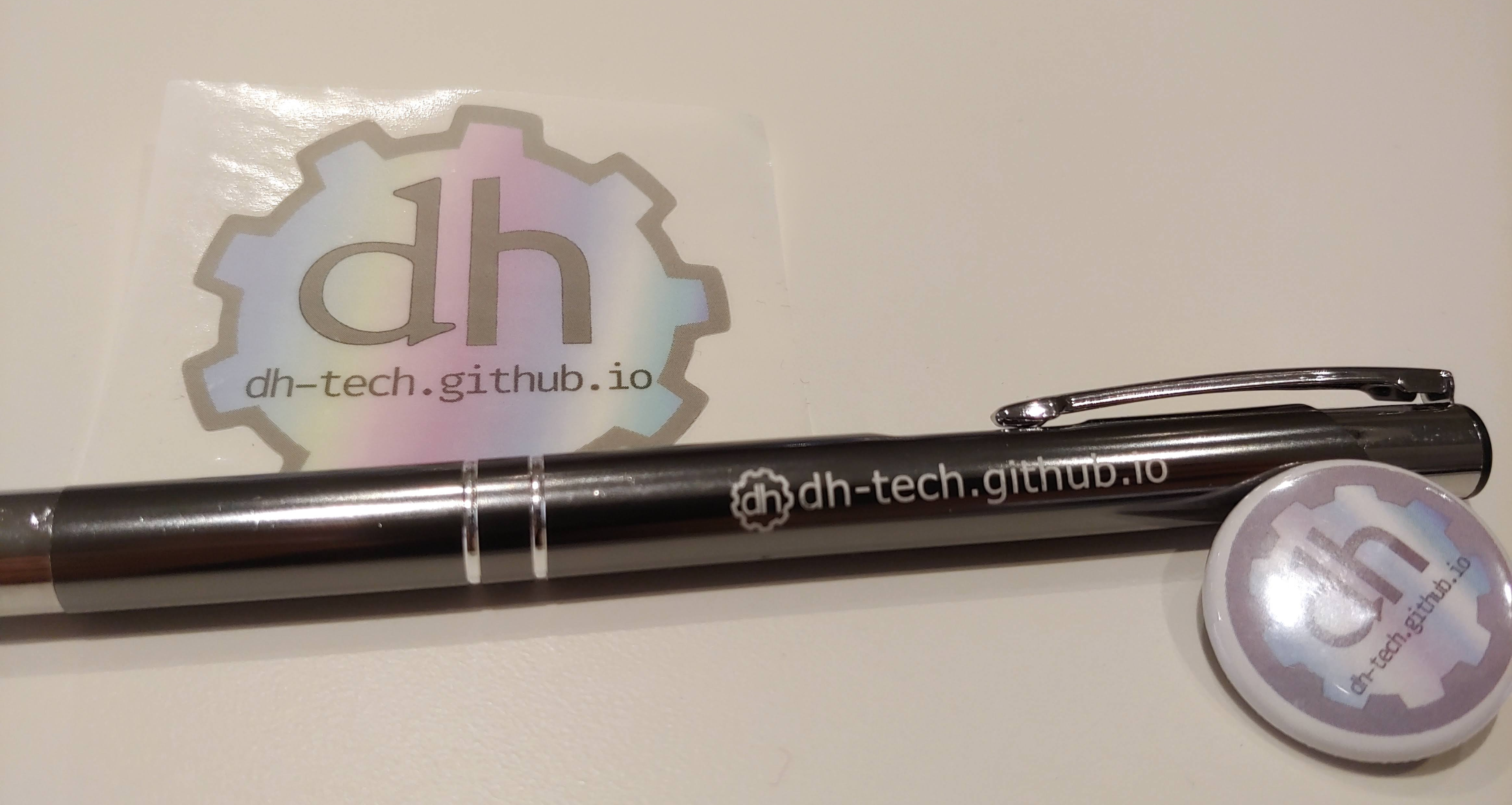
New DHTech logo
I liked the curve of the letters in the original logo and how they fit inside the gear, but I was having trouble finding anything like that, or really any fonts with d and h that would fit nicely inside the curve of the gear.
As I was working on updating the logo, I got the idea to use two different fonts: one of them gesturing at older ways of writing and printing text and one that connected to the more technical and newer aspects of our work. I chose Goudy Bookletter 1911 by Barry Schwartz, which is published as an open-source font, and Ubuntu, which for me has associations with Linux and coding fonts.
I love the new logo, with the juxtaposition of gear and CD-ROM, mechanism and media, history and technology. I hope you enjoy it, too. And if you haven’t gotten any swag yet, keep an eye out for DHTech Steering Committee members at future conferences!